
Our guest today is Scott Hargis, author of the popular book “The Essential Guide to Lighting Interiors”. He is a location photographer specializing in Interiors & Architecture.
Based in the San Francisco Bay Area, Scott also shoots portraiture and adventure sports. Known for his technical expertise and “can-do” attitude, Scott approaches every project with enthusiasm and professionalism, applying creativity and flawless technique to deliver outstanding images under any conditions.
A member of the International Association of Architectural Photographers, Scott also teaches photographers’ workshops throughout the United States, and has been widely recognized as a leader in the Interiors photography genre.
His work has appeared in the San Francisco Chronicle, The Los Angeles Times, This Old House, The East Bay Express, Bay Crossings Magazine, WEND Magazine, and Bay Nature, among others.
You can reach Scott on his web-site: http://scotthargisphoto.com.
Copying or reproduction of this image is prohibited
When and why did you decide to go into commercial interior architectural photography?
As a start-up photographer, I didn’t have a clear direction or genre I wanted to follow. And as the realities of running a fledgling business caught up with me, I was taking on absolutely any sort of gig that would allow me to pay the rent.
I stumbled onto several quasi-architectural jobs and discovered that I really liked them. That led to some regular work shooting hotels for the travel section of the San Francisco Chronicle, as well as other interiors work. And I found (to my surprise) that shooting interiors was deeply satisfying to me.
Now, years later, I’ve gained some insights into why this genre works so well for me. In part, it’s because it’s the right mixture of technical and artistic work. But on a deeper level, I can only say that I just like it. I feel very fortunate that I’m able to work in a genre that is also my passion.
Copying or reproduction of this image is prohibited
Which do you consider to be your most successful commercial project and how were you introduced to the client?
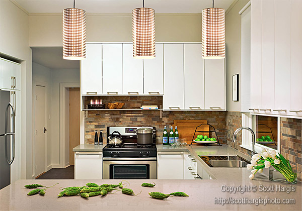
I don’t really think in terms of “most successful” or “best”…but one stand-out shoot was actually on a kitchen remodel that was done on a total “shoe-string” budget.
My client, 1Columbia Design, is both talented and incredibly articulate about design, and we really got into a groove on that shoot. It yielded some of my favorite images, including the one that leads off my website.
We had been shooting that kitchen (which again, was relatively humble) and while the basics were in place, the shots were just lacking something. Then Kathleen (my client) dumped a bag of winter melons on the counter…I made a capture…then we spread them around chaotically…I made a capture…and within ten minutes we had a real “winner”.
When you can relax into a creative zone and let the right side of the brain start talking, great things can happen!
I don’t actually remember how I came to work with 1Columbia….must have been a referral but I honestly can’t remember!
Copying or reproduction of this image is prohibited
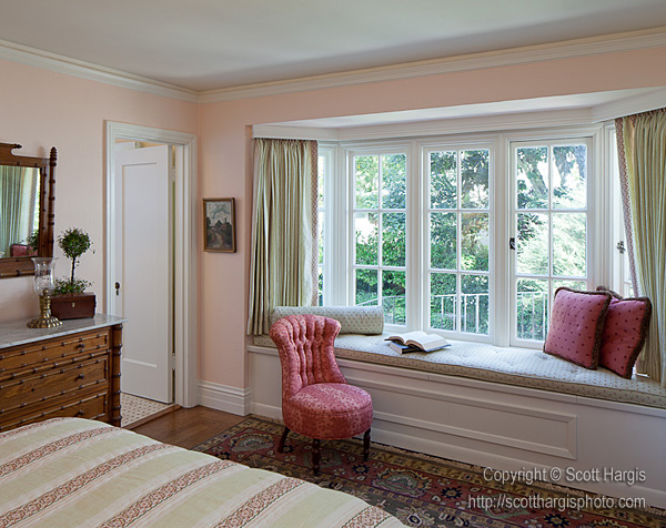
I love the photo below from your portfolio. It creates a sense of coziness in the frame and makes me feel it’s somewhere I’d like to live. In the picture it’s a sunny day outside the window. Do you always use additional lighting equipment? Would you tell us a little bit about this project?
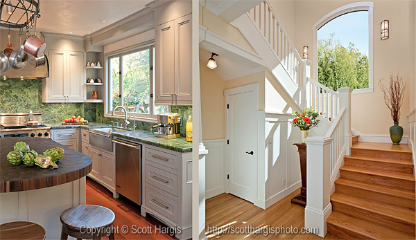
The diptych below is actually two different projects. The right panel, with the staircase, was part of a whole-house remodel in an old Arts-and-Crafts home in Alameda, California. Staircases are something of a hobby of mine; I once hung a fine-art show of staircase photos, so I knew I’d want to shoot this. It wasn’t on the original shot list but I more or less insisted that we shoot it. In the end, the client liked this one more than any other shot from the day.
Copying or reproduction of this image is prohibited
I almost always use supplemental lighting, and in this case there was a head at the top of the stairs, and two more at the bottom, filling in to reproduce the dynamic range my eyes were able to register. The sunlight is real, but the actual view out that window is of the neighbors crappy vinyl siding, so we replaced that with trees/sky in post.
The left panel, by the way, was also a cool project. The builder had sourced some very unusual vivid green stone from a quarry in Montana (or somewhere) and bought it knowing that someday the right project would come along. This particular house is built on top of an outcrop of greenish rock in the Berkeley, California, hills, and the view out the kitchen window is of that rock. The quarry stone makes an absolutely perfect complement to that! While I’m not actually crazy about the coffee machine and bottles on the right side, I do have to say that the artichokes were an absolutely brilliant touch by the stylist – they are a great combination with the stone.
Copying or reproduction of this image is prohibited
In 2010 you brought out a book called “Essential Guide To Lighting Interiors”. What made you decide to issue this book, how long did it take to write, and how did you feel once it had come out?
My background includes a lot of real estate photography. If you’re good, and fast, there’s a lot of money in that. Real estate photographers (and by this I mean “real” real estate photographers – not the CirclePix run-and-gun variety) have a pretty tough job: they have to shoot very wide, pull in every view, and be very, very fast – usually 15 photos in about 90 minutes or so. This combination creates real challenges!
I wrote “Lighting Interiors” because I was getting an average of a dozen or so emails per week asking me for advice and technique. At that point I had been teaching workshops for a couple of years, and I felt that I had a pretty clear curriculum developed which would translate well into a book. And given the clamor for help, it seemed like the demand was there. “Lighting Interiors” is aimed squarely at the Real Estate photographer who is struggling to master off-camera flash photography.
It took me about 8 or 9 months to write it – finding time to write while still maintaining a shoot schedule was tough! I wrote a lot of it on airplanes. After I had a few chapters done, I got more into a rhythm and things moved faster.
I think it’s been a success. It’s aimed at a very niche market, so keeping it as an eBook has made sense. The feedback has been very gratifying.
Copying or reproduction of this image is prohibited
Could I ask you to reveal a few of your secrets for successfully lightning interiors to the beginner photographers out there who haven’t yet read you book? Or perhaps you have some new advice or lessons that didn’t make it into this book, and might appear in the next?
As it happens, I’m working on an update for the book right now. One of the things that didn’t really get covered was composition, specifically with lighting in mind.
But in essence – the “secret” is to set an exposure that’s based on the brightest thing in the scene that you care about (usually a window), and then light everything else to that exposure.
The book covers some very basic techniques for accomplishing this, and hopefully serves as a basis for getting ever more nuanced. Most beginning photographers don’t fully grasp the fundamentals of flash photography, and this really hampers them when they are faced with a big dynamic range.
Understanding how shutter speed, aperture, and ISO interact with each other is only the start. You also have to understand how those factors interact with ambient (constant) light, vs. flash. It’s quite different. Once you’ve got that figured out, though, a whole world of creative freedom opens up. I find that this is a very common gap in beginning photograpers’ skill sets.
Copying or reproduction of this image is prohibited
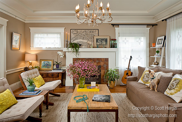
Is it often necessary to make changes to an interior in order to archive the desired result? For example, to swap the sofa or the commode, to select and hang a few pictures or arrange a delicious meal in the kitchen?
All the time. Someone is always responsible for styling, whether it’s just having fresh flowers or fruit available, or whether it’s more intense like steaming the curtains and replacing the entire contents of a bookshelf.
And we move furniture on almost every shoot. There are a few reasons for this. First, sometimes the “normal” furniture arrangement just doesn’t “read” properly from the camera’s perspective. It might be just a matter of adjusting the angle of a chair, or it might be as extreme as moving sofas and desks. We’re trying to render a three-dimensional space into a two dimensional medium, and that often requires some “re-mapping” of the landscape, if you will. The furniture frequently ends up in positions that make no sense to the eye, but again, from the camera’s specific perspective, it looks natural and pleasing.
The other reason for moving furniture is to get the place back to what the original designer intended. If the place has been occupied, it’s a good bet that the original décor has been altered, and furniture placements have been changed.
Copying or reproduction of this image is prohibited
As photographers, we’re sometimes among the priviledged few who will ever experience these fantastic spaces in person. When you think about it, hardly anyone (out of the six billion people on the planet) will get to see Rem Koolhaas’ CCTV building, in Beijing, for example. But through the work of the photographer, millions can experience it, if s/he does a good job in expressing the intent of the architect or designer. So very often we’re the primary portal through which our clients’ work gets seen. I work primarily in residential, so even fewer people will ever actually see the houses I’m shooting. If I do a good job, then I like to think that it’s a contribution.
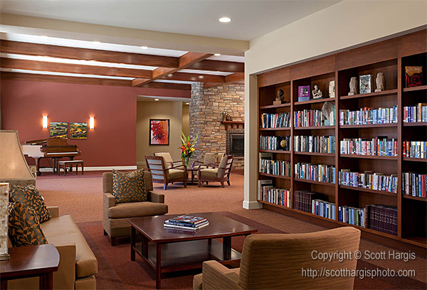
Would you ever refuse a client who wanted photos of an “ugly” interior? Or would you just leave the photos out of your portfolio?
No way. If it doesn’t belong in my portfolio then I don’t have to put it there, but let’s face it: I’m in business, and imposing my personal aesthetics to determine whether I should accept a commission is bad business. I’ve found that sometimes the very first project I get from a client is their lowest-end stuff, because they’re testing me to see if I’m any good. If the project goes well, and they can see that I’m taking it seriously, then they’re more likely to trust me with the good stuff.
Copying or reproduction of this image is prohibited
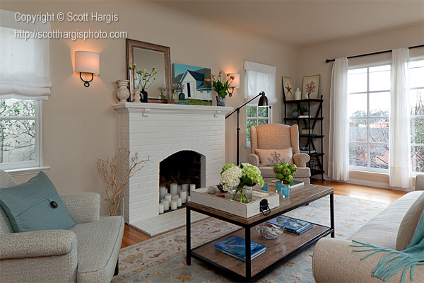
Do you find there are times when commercial shooting becomes boring and routine? And, if so, what does it depend on? Are there any projects you would refuse – or have refused – to shot?
Certain types of projects can become routine, for sure. But not often. I’m usually pretty interested in my clients, and what they’re doing, and what drives their business, and where they think they’re going professionally, etc. etc., so somehow almost every shoot is stimulating, even if the material itself isn’t particularly inspirational.
As for refusing projects – despite what I said earlier, I do turn down work occasionally. For me, it has to be either interesting, fun, or lucrative. If a project can hit 2 out of those three, then I’m in…all the way. But a boring project with a tiny budget? No thanks. I’ll do it once, if I think it will benefit me later on, but eventually you have to decide where your interests lie.
When I’m feeling like I’m in a rut, I know it’s time to crank up the personal work. I love shooting interiors, so a lot of my personal work revolves around that. But I occasionally shoot other stuff, as well. And from time to time I’ll call in a favor from a client and get access to a cool house for a day, and I’ll find a colleague or two to join me for a “development day” – a time to experiment with technique, swap ideas, and just shoot with no pressure, no expectations. Those are very therapeutic.
Copying or reproduction of this image is prohibited
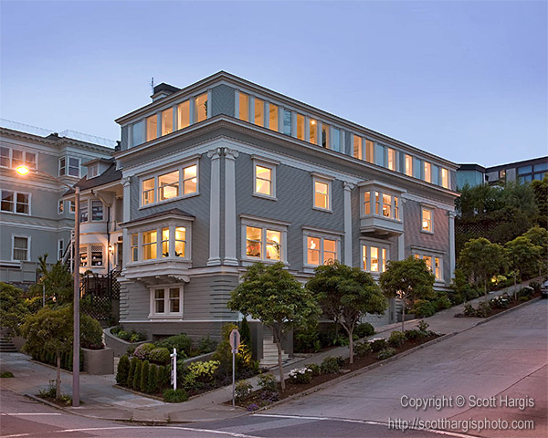
How do most of your clients find you? If you could suggest just one marketing tool to the beginner photographer what would it be?
No question that word of mouth is the best marketing tool there is. But it takes a critical mass of people talking about you to make that a significant factor. To get there, I think you just have to be utterly unrelenting in getting your work in front of people. Show it to anyone who will hold still long enough for you to wave a print in their face.
Next best tool: the telephone. Tell them you’re stopping by their office tomorrow (to wave a print in their face).
Third best is a “trickle marketing” campaign – send emails and postcards out on a regular basis, and keep it up for a few years. It takes many repetitions before people will start remembering your name, and it’s a bit of a numbers game, but a sustained, repetitive campaign will pay off eventually. We’re talking a two to three year cycle, but emails and postcards are cheap, so you can take a long view with this.
Copying or reproduction of this image is prohibited
Maybe this is a bit of a personal question, but I’m sure many people would be very interested to learn the answer. How much would it cost me to hire Scott Hargis? How do you put a price on your services? What’s your price range?
My personal assessment of my work is that I’m just getting to the point where I don’t suck anymore; I think of myself very much as a start-up photographer. As such, I don’t command a premium. I like to remind myself that I started out shooting real estate for $140 per house!
These days, I’ll bill a creative fee anywhere from six or eight hundred on a small project, to the high-four figures on a larger job. I have a fairly simple formula for determining rates, based on the scope of the project, and the intended use of the photos. A lot of my work is solely for the portfolio of an architect, builder, or designer, and doesn’t really “fit” the advertising usage model of pricing. I have rates I apply when that sort of use does come into play, and I make sure that my clients are incented to partner with other interested parties to co-license a shoot.
The ideal place for me is when two parties, say a designer and a builder, go in together to commission a shoot. They both get a discounted rate, and I get a comfortable enough fee that I can sort of relax and put whatever resources and time I need to into the project, without sweating the business side of things too much. That’s just a really great place to be.
I like to make sure that it’s a win-win situation.
Copying or reproduction of this image is prohibited
A list of extra questions
How many years have you been involved in photography – and in architecture photography in particular?
Only about 7 years, and I stumbled onto architectural almost immediately.
Who are your favorite photographers?
Nick Merrick, Chris Barrett, Thomas Struth, Matthew Millman….I could go on and on…
What do you think you would be doing now if you weren’t a photographer?
Hustling cans, pushing a shopping cart down an alley?
What do you enjoy most about being a photographer?
The activity level. I often joke that I have adult-onset ADHD; I can’t sit still very long! Photography allows me to remain active, and keeps my right brain engaged.
Is there anything you dislike about being a photographer?
Bookkeeping!
Copying or reproduction of this image is prohibited


